HARTFORD —The ubiquitous handicapped symbol that marks parking spaces, building entrances and restrooms around the world is getting an update, a modernization that emphasizes ability rather than disability.
What started as a street art project has grown into official acceptance. Yet, the restyled logo has been rejected by some who favor the familiar rigid stick-figure design, which has become one of the most recognizable in the world over the past 40 years.
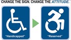
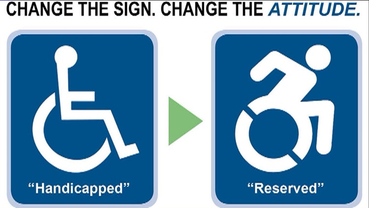
Adoption of the new, modernized International Symbol of Accessibility — which depicts a figure leaning forward in a wheelchair — has been piecemeal:
New York adopted it last year, and Connecticut could soon become the second state to do so. A petition started by The Arc of Farmington Valley to officially change the sign in Connecticut has garnered more than 1,500 signatures.
Lawmakers in Connecticut are expected to take up legislation next year that changes the logo and removes the word “handicapped,” replacing it with “reserved.” To keep costs low, new signs would only be required for new construction or when a sign is replaced.
Jon Slifka, Gov. Dannel P. Malloy’s disability community liaison, said the Democratic governor would sign the bill.
“I think this is just another step in the evolution of disability awareness or disability action, where the disability community doesn’t want to be looked at in just one certain way,” said Slifka, who uses a wheelchair.
Various groups already have embraced the idea. Health insurance giant Cigna, based in Bloomfield, repainted parking spaces at its offices across the country with the updated symbol. It also donated materials to other entities wanting to do the same.
Other cities around the country including Phoenix and El Paso, Texas, are also on board.
But the Federal Highway Administration rejected requests to allow “alternative dynamic designs” for traffic signs and pavement markings. And the International Organization for Standardization has argued against the new design, citing the universal recognition of the original one.
The upgraded symbol also faces opposition from some in the disability rights community. Some disability rights activists believe the new symbol implies prejudice toward people with serious disabilities.
“The old symbol leaves everything up to the imagination,” said Cathy Ludlum, a Connecticut disability rights activist who has a neuromuscular disorder and controls her motorized wheelchair by using three fingers. “The new symbol seems to say that independence has everything to do with the body, which it isn’t. Independence is who you are inside.”
One of the artists who designed the new symbol, Sara Hendren, said that kind of independence is “precisely what we want this thing to represent.”
Hendren, an assistant professor of design at Olin College of Engineering in Needham, Massachusetts, said she felt people were underestimating her son, who has Down syndrome and does not use a wheelchair. She believes the redesigned icon could change attitudes and, ultimately, prompt more funding and better programs.
“I want it to stand for much larger efforts, to improve material conditions,” she said.
Danish graphic artist Susanne Koefoed designed the now well-known logo of a stick figure sitting in a wheelchair in 1968. The symbol was later revamped, with a head added to the body, and designated an international symbol of disability by the United Nations in 1974.
The Swiss-based IOS, the world’s largest developer of voluntary international standards, has said it makes sense to keep the well-known international symbol given the growth in international trade, travel and tourism.